Rogers | Migration
UX DESIGN
RESEARCH
Dates: January to April 2024
Team: GBDA402 Class Group, Rogers Communications as Industry Partner.
Tools Used: Figma for UX/UI design, Adobe Illustrator for graphics, and Figjam for collaborative ideation.
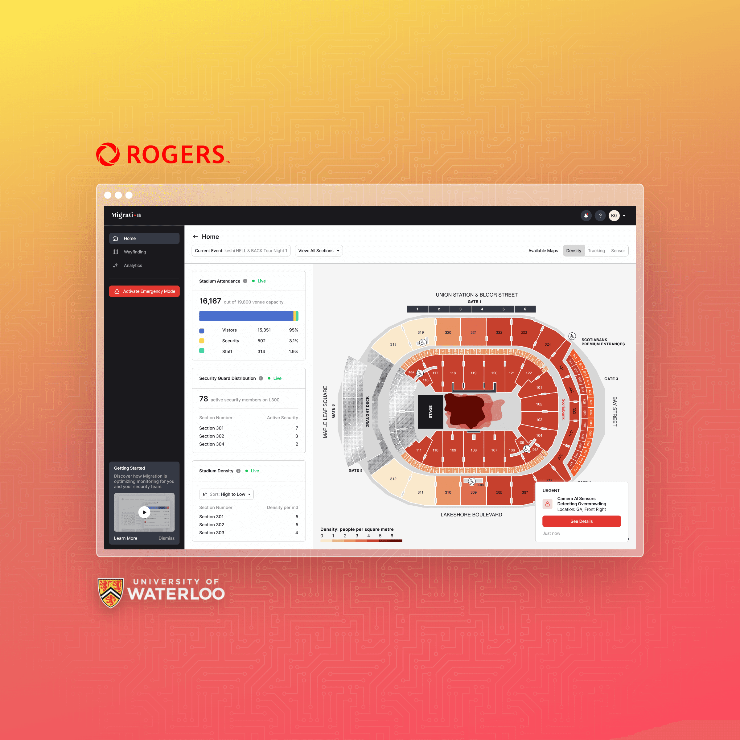
In collaboration with Rogers Communications, Migration was developed as a digital twin solution aimed at enhancing venue safety and efficiency through a digital twin platform. Leveraging 5G technology provided by Rogers (our capstone Industry Partner), this initiative provided an experiential learning opportunity for me and my team to apply our knowledge and skills in a real-world context. My team sought to demonstrate how advanced connectivity could transform the management and operational efficiency of large venues. This case study focuses on the UI/UX design process, showcasing how Migration's interface facilitates quick, easy access to critical safety features.
Navigating the Maze: Crafting Safety in Crowds
Ever tried to find your way around a massive stadium during a sell-out concert or a nail-biting sports match? It's like trying to navigate a maze without a map. According to a study by Deloitte, about 75% of people hitting up stadiums just want to get to their seat without playing a game of "find me if you can."
But here's the kicker: when wayfinding gets tough and security isn't up to scratch, things can go south fast. Consider the harrowing scenario at the Travis Scott Astroworld concert, a grim testament to what can unfold when crowd management fails—resulting in nearly $3 billion in lawsuits, alongside the profound loss of life and numerous injuries. Similarly, a Daddy Yankee concert witnessed a breach of safety when an overwhelming crowd overwhelmed security measures, leading to legal repercussions for the involved private security firms. These events turned from epic nights out to cautionary tales, showing us the high stakes of getting crowd management wrong. As such, our mission was to empower security for safer communities.
Meet the Team

Taking Charge: My Role as Project Manager
Though everyone on our team contributed to each role in some capacity or another, we each had our main roles. As project manager, my key tasks involved:
Collaborating closely with designers, researchers, and business analysts from the get-go, guiding us through brainstorming, digging into research, and shaping our design.
Keeping tabs on the project's progress across all fronts, making sure everyone knew what they were supposed to do. I did this by writing and distributing weekly updates, scheduling meet-ups, and jotting down who needed to do what.
Jumping on any hiccups along the way to keep us ticking along to our deadlines. This often meant jumping into quick calls or firing off messages to clear up any confusion or lend a hand where it was needed.
Getting Down to Business
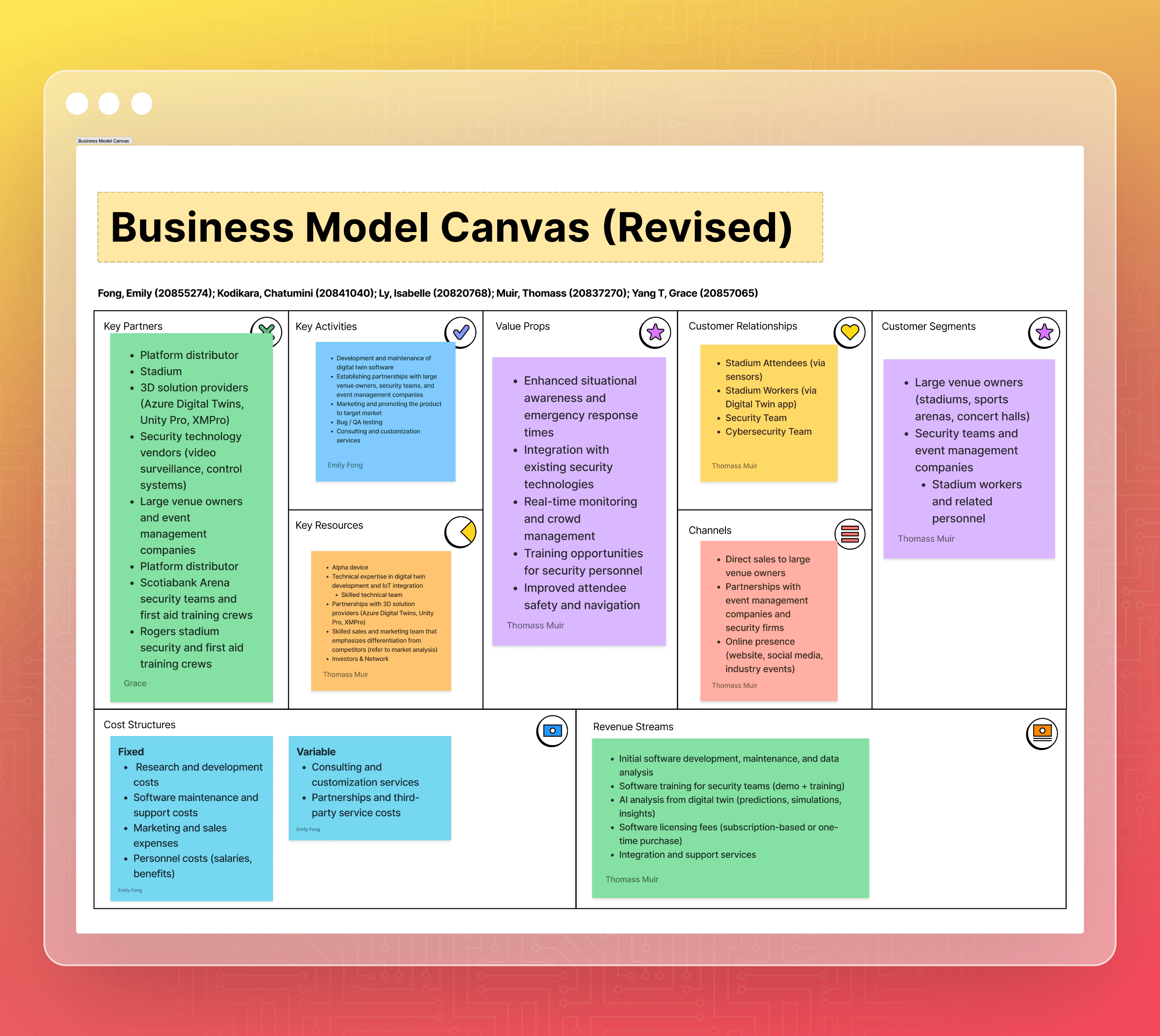
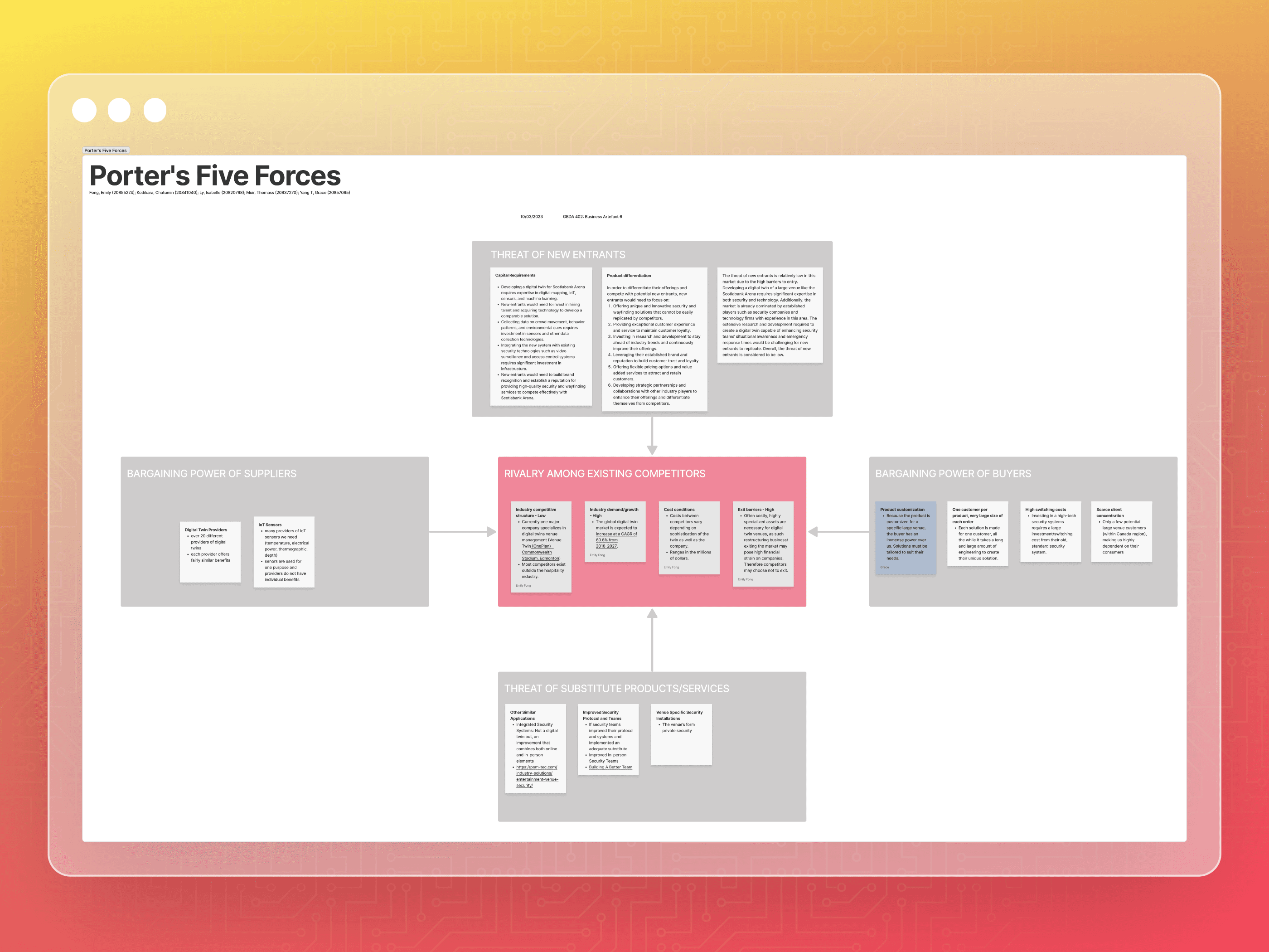
As our capstone project, we were not only busy with UX research tasks, but with business analyzing tasks as well. To truly understand our value proposition and position within the market, we did secondary research to create various business artifacts, such as our Business Model Canvas, and our Porter's Five Forces chart:
Design Process
A detailed journey unfolded as our team moved from understanding the user's environment to conceptualizing a solution that bridges security personnel's needs with technological capabilities.
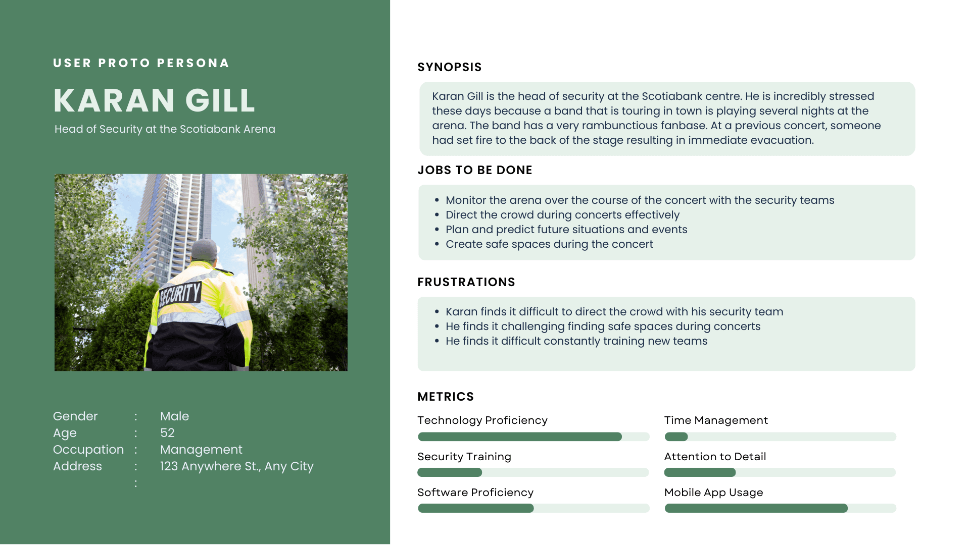
User Research: After interviewing real security personnel and Scotiabank guards, we defined a clear user persona in "Karan Gill" - the head of security at the Scotiabank Arena. We mapped out his interactions and pain points within the venue management ecosystem.
Ideation: Multiple brainstorming sessions led to the creation of innovative solutions, focusing on intuitive design and functionality. We eventually settled on a wayfinding digital twin solution
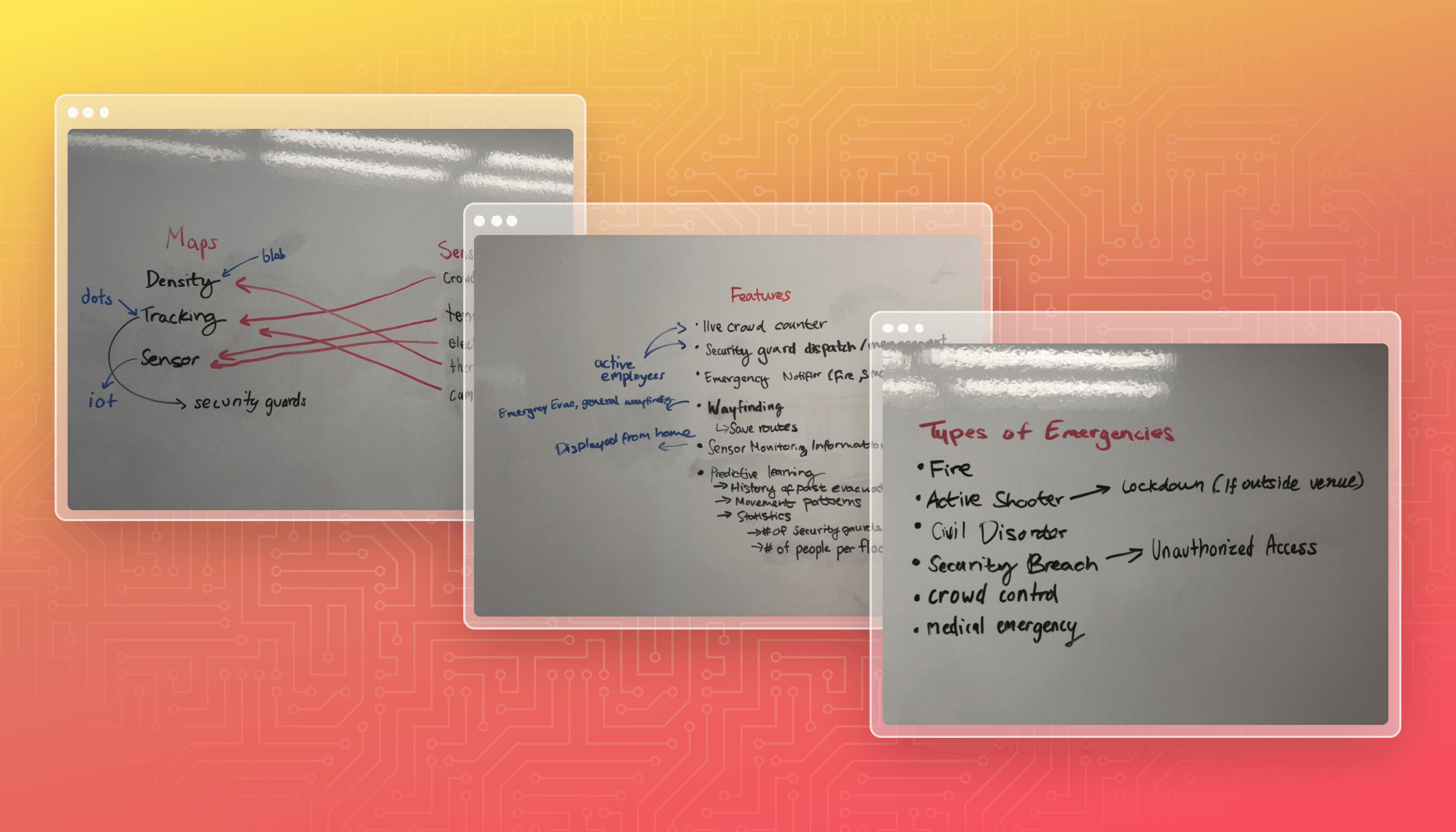
Our Idea: We eventually settled on a wayfinding digital twin solution that would leverage 5G technology to optimize wayfinding and crowd management.
User Flows and Storyboarding
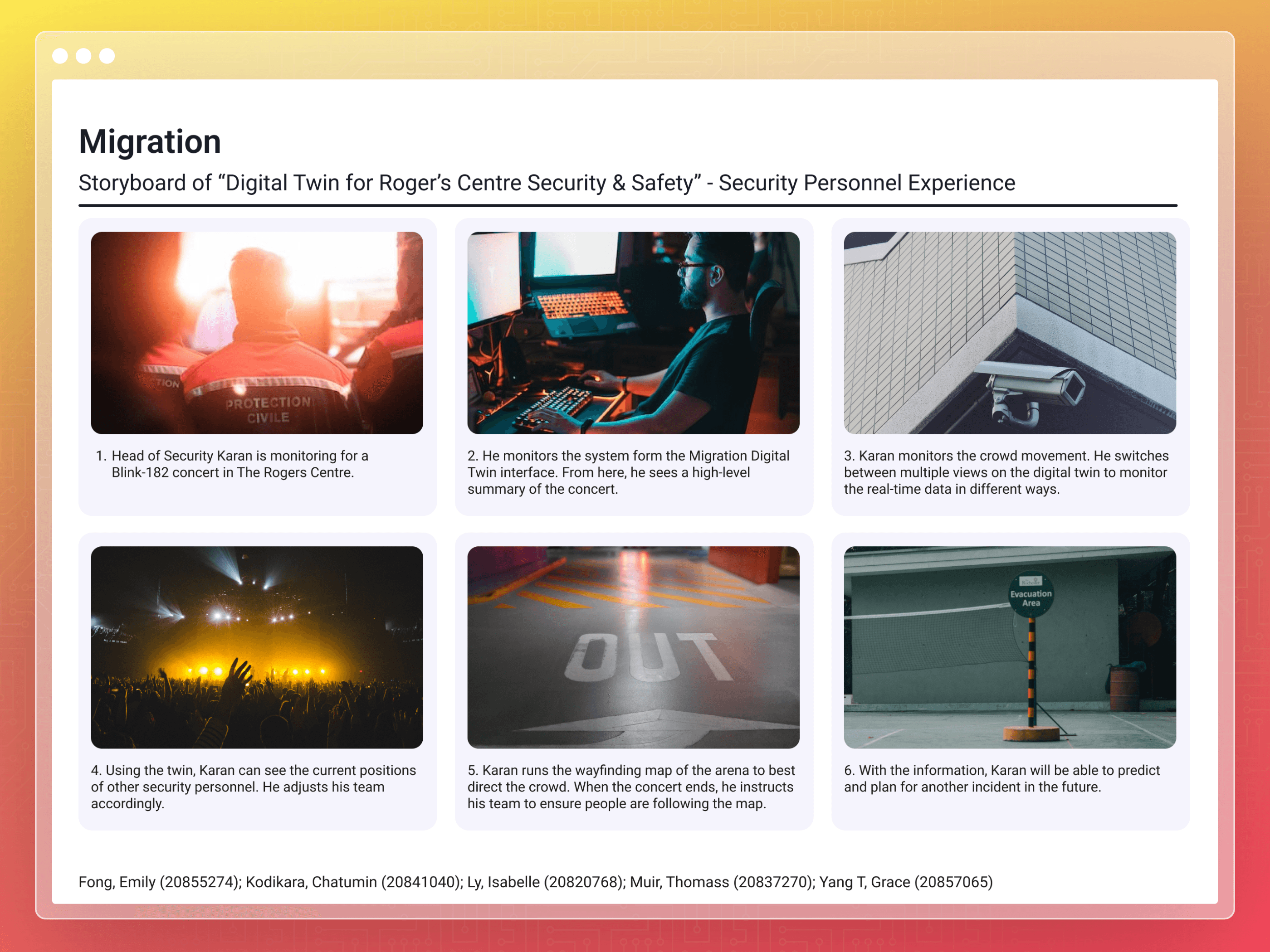
Before prototyping, we needed to understand how our app would flow. We made a series of simple user flows to help us envision not just how the app would look, but how the app would feel. Here are a few situations we came up with:
Emergency Evacuation: Simplifying the process for security personnel to initiate and manage evacuation protocols.
Crowd Density Monitoring: Enabling proactive crowd management by visualizing density data and suggesting adjustments.
Incident Reporting Workflow: Streamlining the process for reporting and responding to incidents within the app.
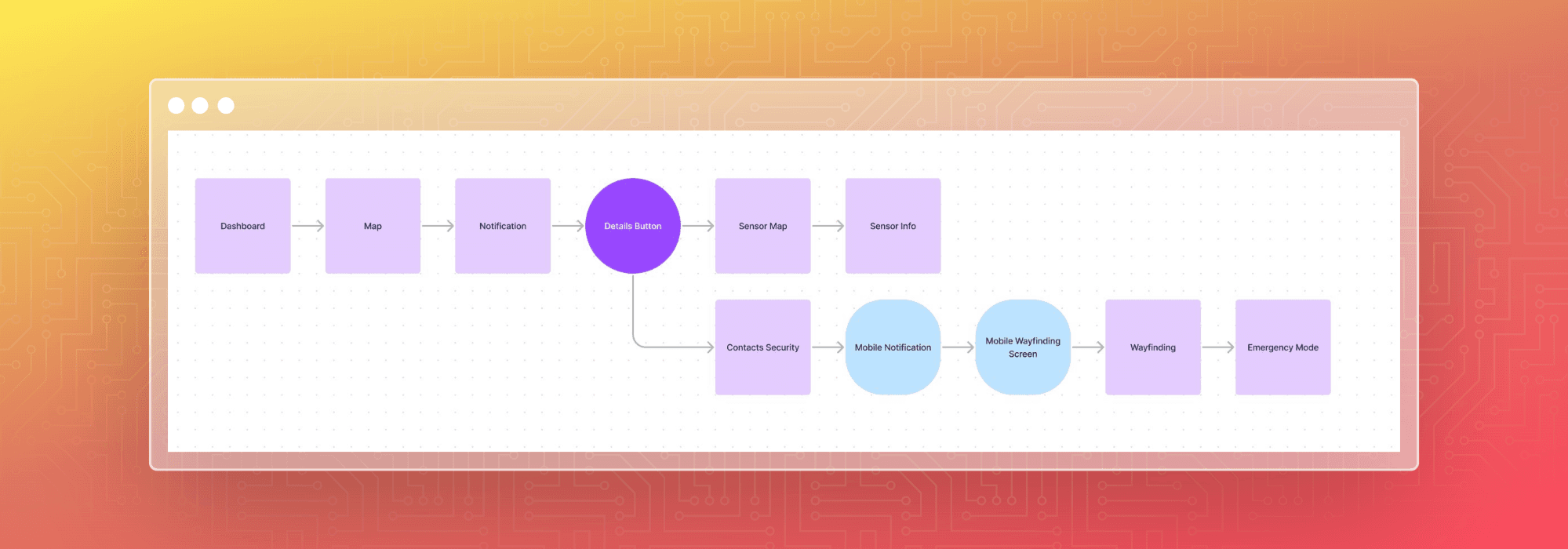
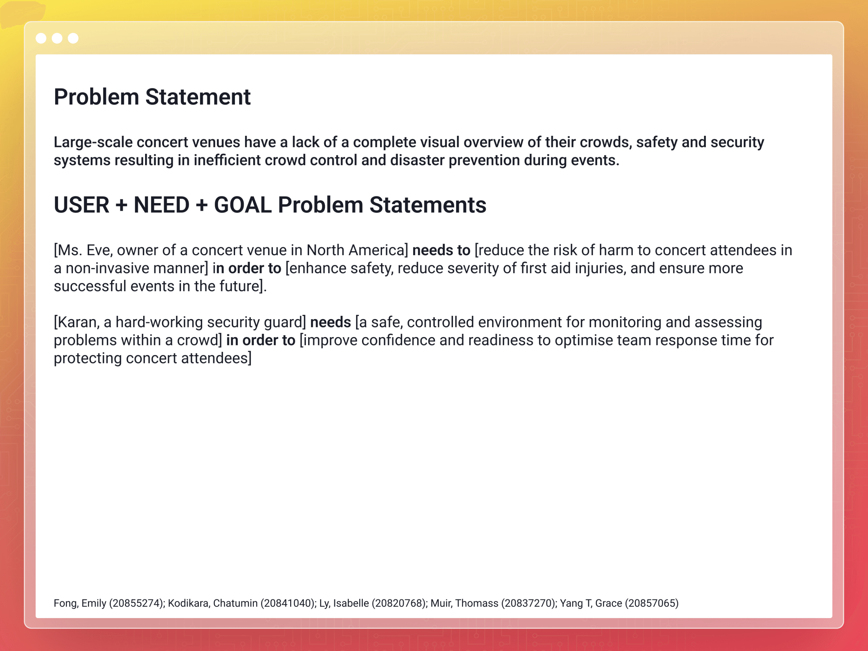
This alone wasn't enough to tell the full story. In order to fully envision our users, their needs, and their goals, we created various problem statements and storyboards to further help envision their experiences.
Prototype Development and Execution
Numerous stadium digital twin solutions have been proposed in the past, such as the one for the 2022 Qatar World Cup Stadium, yet they often fall short in focusing deeply on specific functionalities. To bridge this gap, we crafted a 2D prototype enriched with 3D elements using Figma, aiming for a design that closely mirrors actual interactions users might have with the system. The incorporation of 3D features, particularly in our wayfinding functionality, introduces digital and physical signage across the stadium environment, enhancing the user's navigational experience. Ideally, collaboration with 3D solution providers would bring these digital concepts into the tangible world.
Data Visualization

The essence of our solution is encapsulated in its approach to data presentation and wayfinding methodology. Through extensive market analysis and exploration of competitor offerings, we delved into numerous data visualization techniques. This exploration led us to draw inspiration from smart city interfaces, which effectively use maps to convey sensor-generated data, enabling users to make informed decisions swiftly.
Branding

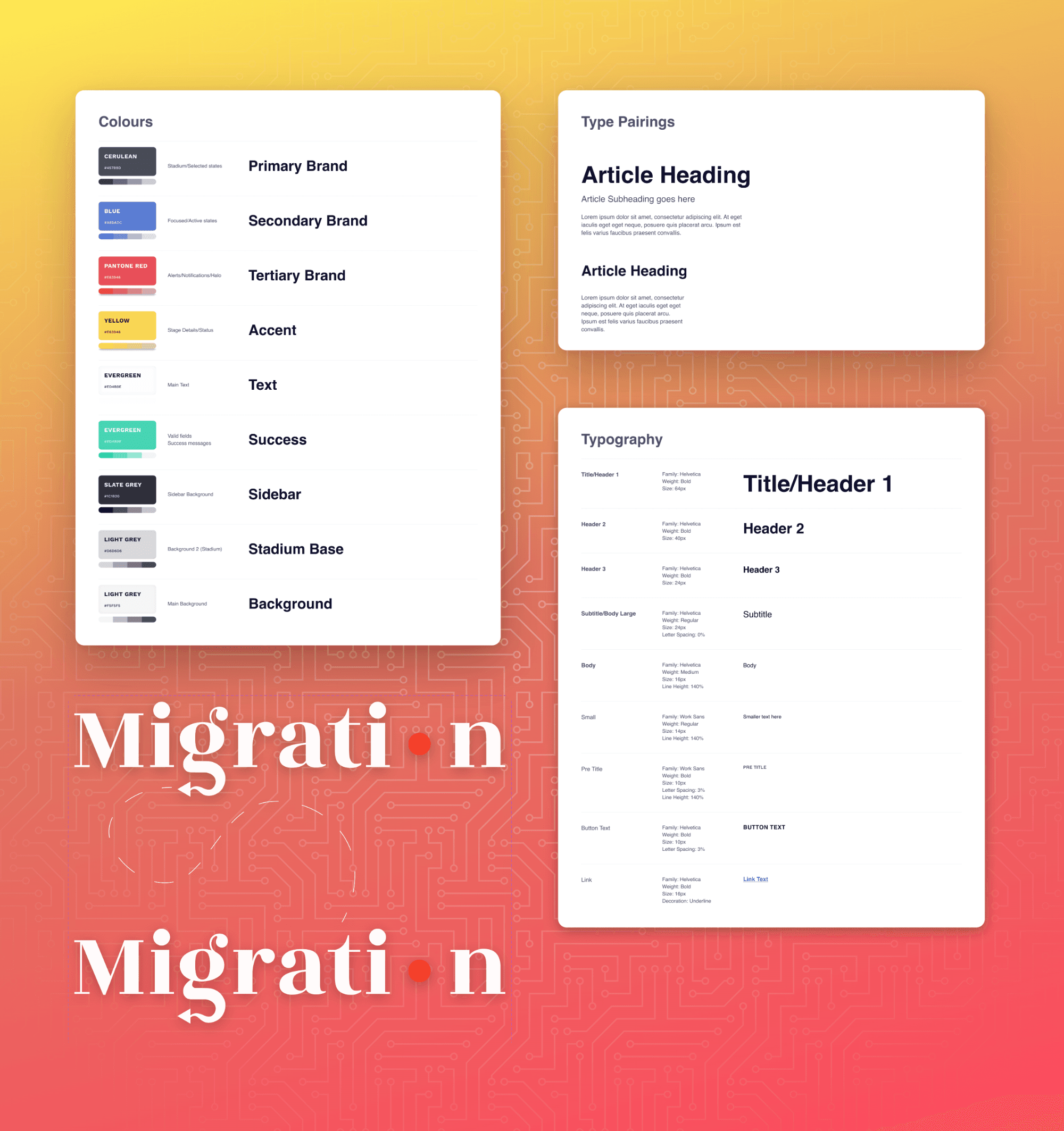
From a branding and UI perspective, we opted for a streamlined interface that prioritizes information clarity, adopting a restrained color scheme to facilitate easy comprehension of various states and alerts. This design strategy meticulously categorizes issues and alerts, employing color coding to signify the gravity of different situations. Our solution is uniquely tailored to enhance wayfinding capabilities, ensuring information is not only accessible but also actionable, fostering a user experience that is both intuitive and efficient.
Usability Testing
Unfortunately, we only had enough time for one round of user testing after finishing our prototypes. However, due to our thorough process, we were able to gather a lot of feedback that helped us tailor our final product. Here’s a concise summary of our findings and action items:
Discussion & Findings
Alerts & Notifications: Establishing a clear threshold for severity levels and sorting notifications accordingly emerged as crucial. This ensures clarity in communication, especially in distinguishing between various emergency scenarios.
Navigation Enhancements: The necessity for a "create route" feature was highlighted to aid in navigation within the venue, both for daily operations and emergencies. Additionally, incorporating back buttons for easier navigation and clarifying ambiguous terms in alert messages were identified as key areas for improvement.
Interface Clarity: Feedback pointed to some confusion caused by the current copy and a lack of clarity on features like the "satellite view" and "lockdown mode". Simplifying the language and providing clearer instructions were suggested.
First Impressions & Wayfinding
The home screen layout was generally well-received, though improvements in text size and color usage were recommended for better engagement.
Finding the density map was straightforward for most, but the desire for more prominent exits and improved font sizes was noted.
Enhancements in the wayfinding feature, such as more intuitive map interactions and clearer path indications, were suggested.
Action Items
Develop a consistent design system, particularly for text sizing and color-coding, to improve readability and visual appeal.
Revise the alert system to provide clearer distinctions between different levels of severity and the specific nature of each alert.
Enhance map functionality with visible paths, destinations, and interactive sensor information. Consider overlaying different maps for comprehensive management.
Implement a back/return button for smoother navigation across the platform.
Clarify the function and application of features such as "satellite view" and "lockdown mode", ensuring users understand their usage.
Introduce an onboarding tutorial or guide, particularly for the wayfinding settings and predictive learning aspects, to aid new users.
Prototype Walkthrough
Interactive Prototype
To see Migration in action, view our prototype below or view the prototype on Figma (recommended for mobile users). As the prototype is meant for a tablet, it might be difficult to view on mobile.


Rogers | Migration
UX DESIGN
RESEARCH
Dates: January to April 2024
Team: GBDA402 Class Group, Rogers Communications as Industry Partner.
Tools Used: Figma for UX/UI design, Adobe Illustrator for graphics, and Figjam for collaborative ideation.
In collaboration with Rogers Communications, Migration was developed as a digital twin solution aimed at enhancing venue safety and efficiency through a digital twin platform. Leveraging 5G technology provided by Rogers (our capstone Industry Partner), this initiative provided an experiential learning opportunity for me and my team to apply our knowledge and skills in a real-world context. My team sought to demonstrate how advanced connectivity could transform the management and operational efficiency of large venues. This case study focuses on the UI/UX design process, showcasing how Migration's interface facilitates quick, easy access to critical safety features.

Navigating the Maze: Crafting Safety in Crowds
Ever tried to find your way around a massive stadium during a sell-out concert or a nail-biting sports match? It's like trying to navigate a maze without a map. According to a study by Deloitte, about 75% of people hitting up stadiums just want to get to their seat without playing a game of "find me if you can."
But here's the kicker: when wayfinding gets tough and security isn't up to scratch, things can go south fast. Consider the harrowing scenario at the Travis Scott Astroworld concert, a grim testament to what can unfold when crowd management fails—resulting in nearly $3 billion in lawsuits, alongside the profound loss of life and numerous injuries. Similarly, a Daddy Yankee concert witnessed a breach of safety when an overwhelming crowd overwhelmed security measures, leading to legal repercussions for the involved private security firms. These events turned from epic nights out to cautionary tales, showing us the high stakes of getting crowd management wrong. As such, our mission was to empower security for safer communities.
Meet the Team

Taking Charge: My Role as Project Manager
Though everyone on our team contributed to each role in some capacity or another, we each had our main roles. As project manager, my key tasks involved:
Collaborating closely with designers, researchers, and business analysts from the get-go, guiding us through brainstorming, digging into research, and shaping our design.
Keeping tabs on the project's progress across all fronts, making sure everyone knew what they were supposed to do. I did this by writing and distributing weekly updates, scheduling meet-ups, and jotting down who needed to do what.
Jumping on any hiccups along the way to keep us ticking along to our deadlines. This often meant jumping into quick calls or firing off messages to clear up any confusion or lend a hand where it was needed.
Getting Down to Business
As our capstone project, we were not only busy with UX research tasks, but with business analyzing tasks as well. To truly understand our value proposition and position within the market, we did secondary research to create various business artifacts, such as our Business Model Canvas, and our Porter's Five Forces chart:


Design Process
A detailed journey unfolded as our team moved from understanding the user's environment to conceptualizing a solution that bridges security personnel's needs with technological capabilities.
User Research: After interviewing real security personnel and Scotiabank guards, we defined a clear user persona in "Karan Gill" - the head of security at the Scotiabank Arena. We mapped out his interactions and pain points within the venue management ecosystem.

Ideation: Multiple brainstorming sessions led to the creation of innovative solutions, focusing on intuitive design and functionality. We eventually settled on a wayfinding digital twin solution

Our Idea: We eventually settled on a wayfinding digital twin solution that would leverage 5G technology to optimize wayfinding and crowd management.
User Flows and Storyboarding
Before prototyping, we needed to understand how our app would flow. We made a series of simple user flows to help us envision not just how the app would look, but how the app would feel. Here are a few situations we came up with:
Emergency Evacuation: Simplifying the process for security personnel to initiate and manage evacuation protocols.
Crowd Density Monitoring: Enabling proactive crowd management by visualizing density data and suggesting adjustments.
Incident Reporting Workflow: Streamlining the process for reporting and responding to incidents within the app.

This alone wasn't enough to tell the full story. In order to fully envision our users, their needs, and their goals, we created various problem statements and storyboards to further help envision their experiences.


Prototype Development and Execution
Numerous stadium digital twin solutions have been proposed in the past, such as the one for the 2022 Qatar World Cup Stadium, yet they often fall short in focusing deeply on specific functionalities. To bridge this gap, we crafted a 2D prototype enriched with 3D elements using Figma, aiming for a design that closely mirrors actual interactions users might have with the system. The incorporation of 3D features, particularly in our wayfinding functionality, introduces digital and physical signage across the stadium environment, enhancing the user's navigational experience. Ideally, collaboration with 3D solution providers would bring these digital concepts into the tangible world.
Data Visualization

The essence of our solution is encapsulated in its approach to data presentation and wayfinding methodology. Through extensive market analysis and exploration of competitor offerings, we delved into numerous data visualization techniques. This exploration led us to draw inspiration from smart city interfaces, which effectively use maps to convey sensor-generated data, enabling users to make informed decisions swiftly.
Branding

From a branding and UI perspective, we opted for a streamlined interface that prioritizes information clarity, adopting a restrained color scheme to facilitate easy comprehension of various states and alerts. This design strategy meticulously categorizes issues and alerts, employing color coding to signify the gravity of different situations. Our solution is uniquely tailored to enhance wayfinding capabilities, ensuring information is not only accessible but also actionable, fostering a user experience that is both intuitive and efficient.

Usability Testing
Unfortunately, we only had enough time for one round of user testing after finishing our prototypes. However, due to our thorough process, we were able to gather a lot of feedback that helped us tailor our final product. Here’s a concise summary of our findings and action items:
Discussion & Findings
Alerts & Notifications: Establishing a clear threshold for severity levels and sorting notifications accordingly emerged as crucial. This ensures clarity in communication, especially in distinguishing between various emergency scenarios.
Navigation Enhancements: The necessity for a "create route" feature was highlighted to aid in navigation within the venue, both for daily operations and emergencies. Additionally, incorporating back buttons for easier navigation and clarifying ambiguous terms in alert messages were identified as key areas for improvement.
Interface Clarity: Feedback pointed to some confusion caused by the current copy and a lack of clarity on features like the "satellite view" and "lockdown mode". Simplifying the language and providing clearer instructions were suggested.
First Impressions & Wayfinding
The home screen layout was generally well-received, though improvements in text size and color usage were recommended for better engagement.
Finding the density map was straightforward for most, but the desire for more prominent exits and improved font sizes was noted.
Enhancements in the wayfinding feature, such as more intuitive map interactions and clearer path indications, were suggested.
Action Items
Develop a consistent design system, particularly for text sizing and color-coding, to improve readability and visual appeal.
Revise the alert system to provide clearer distinctions between different levels of severity and the specific nature of each alert.
Enhance map functionality with visible paths, destinations, and interactive sensor information. Consider overlaying different maps for comprehensive management.
Implement a back/return button for smoother navigation across the platform.
Clarify the function and application of features such as "satellite view" and "lockdown mode", ensuring users understand their usage.
Introduce an onboarding tutorial or guide, particularly for the wayfinding settings and predictive learning aspects, to aid new users.
Prototype Walkthrough
Interactive Prototype
To see Migration in action, view our prototype below or view the prototype on Figma (recommended for mobile users). As the prototype is meant for a tablet, it might be difficult to view on mobile.


Rogers | Migration
UX DESIGN
RESEARCH
Dates: January to April 2024
Team: GBDA402 Class Group, Rogers Communications as Industry Partner.
Tools Used: Figma for UX/UI design, Adobe Illustrator for graphics, and Figjam for collaborative ideation.
In collaboration with Rogers Communications, Migration was developed as a digital twin solution aimed at enhancing venue safety and efficiency through a digital twin platform. Leveraging 5G technology provided by Rogers (our capstone Industry Partner), this initiative provided an experiential learning opportunity for me and my team to apply our knowledge and skills in a real-world context. My team sought to demonstrate how advanced connectivity could transform the management and operational efficiency of large venues. This case study focuses on the UI/UX design process, showcasing how Migration's interface facilitates quick, easy access to critical safety features.

Navigating the Maze: Crafting Safety in Crowds
Ever tried to find your way around a massive stadium during a sell-out concert or a nail-biting sports match? It's like trying to navigate a maze without a map. According to a study by Deloitte, about 75% of people hitting up stadiums just want to get to their seat without playing a game of "find me if you can."
But here's the kicker: when wayfinding gets tough and security isn't up to scratch, things can go south fast. Consider the harrowing scenario at the Travis Scott Astroworld concert, a grim testament to what can unfold when crowd management fails—resulting in nearly $3 billion in lawsuits, alongside the profound loss of life and numerous injuries. Similarly, a Daddy Yankee concert witnessed a breach of safety when an overwhelming crowd overwhelmed security measures, leading to legal repercussions for the involved private security firms. These events turned from epic nights out to cautionary tales, showing us the high stakes of getting crowd management wrong. As such, our mission was to empower security for safer communities.
Meet the Team

Taking Charge: My Role as Project Manager
Though everyone on our team contributed to each role in some capacity or another, we each had our main roles. As project manager, my key tasks involved:
Collaborating closely with designers, researchers, and business analysts from the get-go, guiding us through brainstorming, digging into research, and shaping our design.
Keeping tabs on the project's progress across all fronts, making sure everyone knew what they were supposed to do. I did this by writing and distributing weekly updates, scheduling meet-ups, and jotting down who needed to do what.
Jumping on any hiccups along the way to keep us ticking along to our deadlines. This often meant jumping into quick calls or firing off messages to clear up any confusion or lend a hand where it was needed.
Getting Down to Business
As our capstone project, we were not only busy with UX research tasks, but with business analyzing tasks as well. To truly understand our value proposition and position within the market, we did secondary research to create various business artifacts, such as our Business Model Canvas, and our Porter's Five Forces chart:


Design Process
A detailed journey unfolded as our team moved from understanding the user's environment to conceptualizing a solution that bridges security personnel's needs with technological capabilities.
User Research: After interviewing real security personnel and Scotiabank guards, we defined a clear user persona in "Karan Gill" - the head of security at the Scotiabank Arena. We mapped out his interactions and pain points within the venue management ecosystem.

Ideation: Multiple brainstorming sessions led to the creation of innovative solutions, focusing on intuitive design and functionality. We eventually settled on a wayfinding digital twin solution

Our Idea: We eventually settled on a wayfinding digital twin solution that would leverage 5G technology to optimize wayfinding and crowd management.
User Flows and Storyboarding
Before prototyping, we needed to understand how our app would flow. We made a series of simple user flows to help us envision not just how the app would look, but how the app would feel. Here are a few situations we came up with:
Emergency Evacuation: Simplifying the process for security personnel to initiate and manage evacuation protocols.
Crowd Density Monitoring: Enabling proactive crowd management by visualizing density data and suggesting adjustments.
Incident Reporting Workflow: Streamlining the process for reporting and responding to incidents within the app.

This alone wasn't enough to tell the full story. In order to fully envision our users, their needs, and their goals, we created various problem statements and storyboards to further help envision their experiences.


Prototype Development and Execution
Numerous stadium digital twin solutions have been proposed in the past, such as the one for the 2022 Qatar World Cup Stadium, yet they often fall short in focusing deeply on specific functionalities. To bridge this gap, we crafted a 2D prototype enriched with 3D elements using Figma, aiming for a design that closely mirrors actual interactions users might have with the system. The incorporation of 3D features, particularly in our wayfinding functionality, introduces digital and physical signage across the stadium environment, enhancing the user's navigational experience. Ideally, collaboration with 3D solution providers would bring these digital concepts into the tangible world.
Data Visualization

The essence of our solution is encapsulated in its approach to data presentation and wayfinding methodology. Through extensive market analysis and exploration of competitor offerings, we delved into numerous data visualization techniques. This exploration led us to draw inspiration from smart city interfaces, which effectively use maps to convey sensor-generated data, enabling users to make informed decisions swiftly.
Branding

From a branding and UI perspective, we opted for a streamlined interface that prioritizes information clarity, adopting a restrained color scheme to facilitate easy comprehension of various states and alerts. This design strategy meticulously categorizes issues and alerts, employing color coding to signify the gravity of different situations. Our solution is uniquely tailored to enhance wayfinding capabilities, ensuring information is not only accessible but also actionable, fostering a user experience that is both intuitive and efficient.

Usability Testing
Unfortunately, we only had enough time for one round of user testing after finishing our prototypes. However, due to our thorough process, we were able to gather a lot of feedback that helped us tailor our final product. Here’s a concise summary of our findings and action items:
Discussion & Findings
Alerts & Notifications: Establishing a clear threshold for severity levels and sorting notifications accordingly emerged as crucial. This ensures clarity in communication, especially in distinguishing between various emergency scenarios.
Navigation Enhancements: The necessity for a "create route" feature was highlighted to aid in navigation within the venue, both for daily operations and emergencies. Additionally, incorporating back buttons for easier navigation and clarifying ambiguous terms in alert messages were identified as key areas for improvement.
Interface Clarity: Feedback pointed to some confusion caused by the current copy and a lack of clarity on features like the "satellite view" and "lockdown mode". Simplifying the language and providing clearer instructions were suggested.
First Impressions & Wayfinding
The home screen layout was generally well-received, though improvements in text size and color usage were recommended for better engagement.
Finding the density map was straightforward for most, but the desire for more prominent exits and improved font sizes was noted.
Enhancements in the wayfinding feature, such as more intuitive map interactions and clearer path indications, were suggested.
Action Items
Develop a consistent design system, particularly for text sizing and color-coding, to improve readability and visual appeal.
Revise the alert system to provide clearer distinctions between different levels of severity and the specific nature of each alert.
Enhance map functionality with visible paths, destinations, and interactive sensor information. Consider overlaying different maps for comprehensive management.
Implement a back/return button for smoother navigation across the platform.
Clarify the function and application of features such as "satellite view" and "lockdown mode", ensuring users understand their usage.
Introduce an onboarding tutorial or guide, particularly for the wayfinding settings and predictive learning aspects, to aid new users.
Prototype Walkthrough
Interactive Prototype
To see Migration in action, view our prototype below or view the prototype on Figma (recommended for mobile users). As the prototype is meant for a tablet, it might be difficult to view on mobile.


