City of Toronto | Optimizing Service Request Navigation
RESEARCH
ANALYSIS
As a research intern at the City of Toronto, I was tasked with the challenge of enhancing the digital interface through which residents interact with city services. This case study outlines a UX research project conducted by a research intern at the City of Toronto, focusing on improving the digital interface for city service requests. The project's goal was to make online submissions more intuitive, thereby reducing reliance on phone-based inquiries.
Through a comprehensive study involving 341 participants, key areas for improvement were identified in iconography, category organization, and the overall navigational structure of the service request portal. Recommendations include redesigning ambiguous icons, reorganizing service categories for better intuitiveness, and making specific service requests more accessible. This study aims to enhance the user experience significantly, making the digital portal a preferable option for city residents.
Background
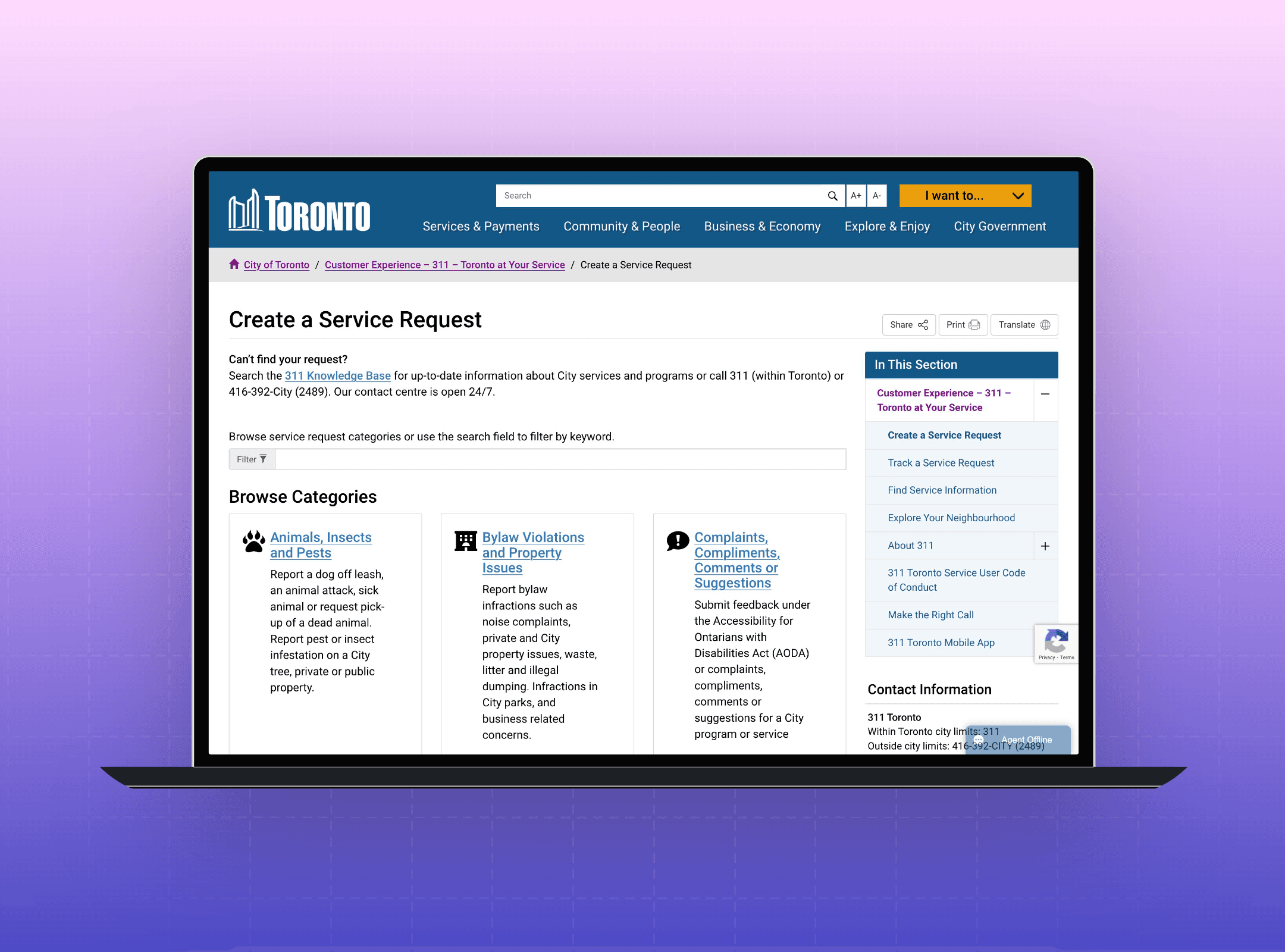
Prior observations and user feedback highlighted challenges within the City of Toronto’s digital interface for service requests. Users reported difficulties in navigating the system, identifying the correct categories for their needs, and understanding the icons used on the portal. These issues contributed to a reliance on phone-based inquiries, indicating a clear need for a more intuitive online submission process.
Objective
The primary goal was to evaluate and enhance the user experience on the City of Toronto website, specifically within the service request sections. We aimed to achieve specific improvements in user behavior, such as a 20% increase in online submissions and a 15% reduction in phone inquiries, by making the navigation process simple and intuitive for all residents.
Participant Profile
The research involved a diverse group of 50 to 200 Toronto residents, varying in their experiences with city services, demographic characteristics (age and location), and familiarity with the city's digital resources. This diverse mix was intended to provide a comprehensive understanding of different user experiences and perspectives.
Methodology
We conducted the study using remote, unmoderated sessions, employing OptimalSort and Treejack from Optimal Workshop's UX suite. The process began with participants answering initial questions, followed by tasks that involved sorting, finding, and matching various service request features into predefined categories and subcategories. This also included assessing the effectiveness of labels, icons, and their distinctiveness. Post-test feedback was collected to identify potential improvements.
Activity 1: Icon Evaluation
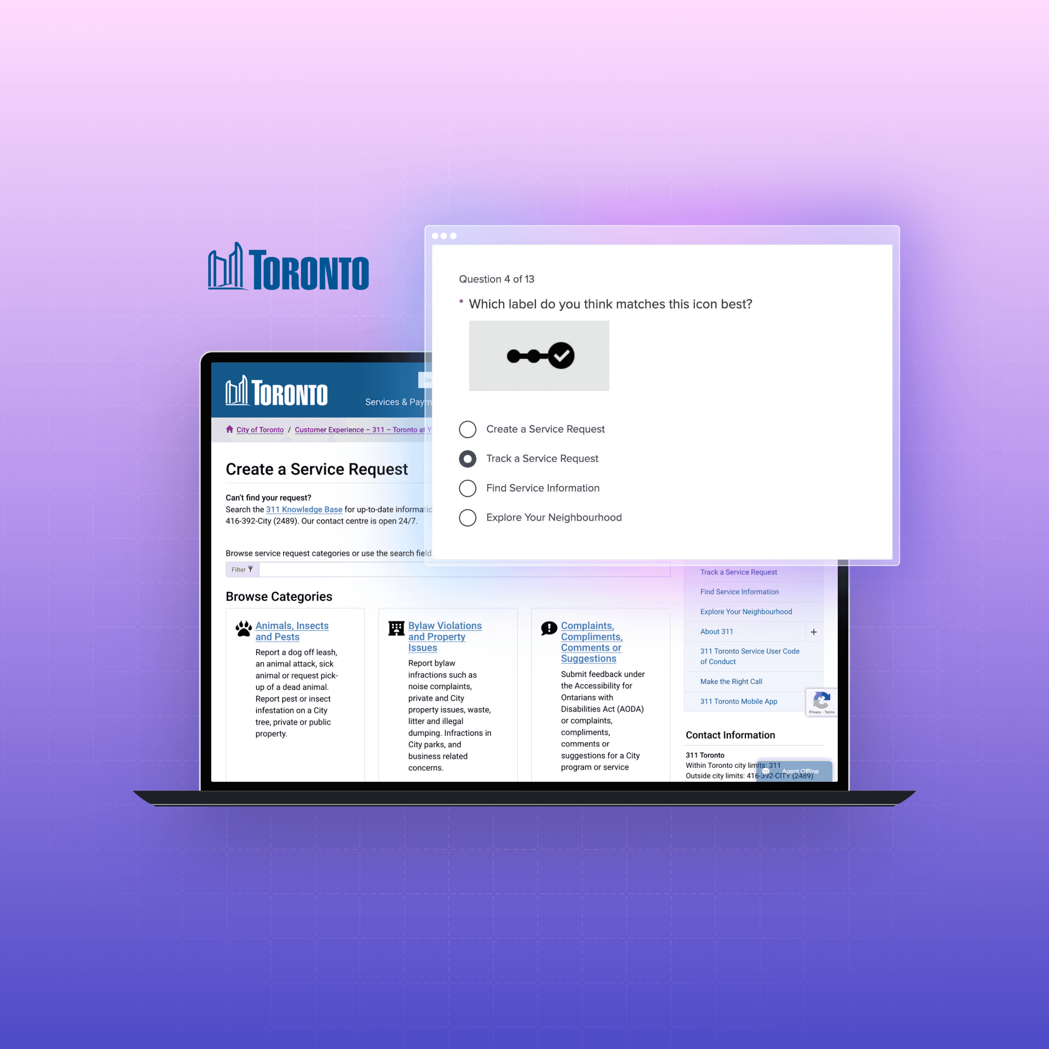
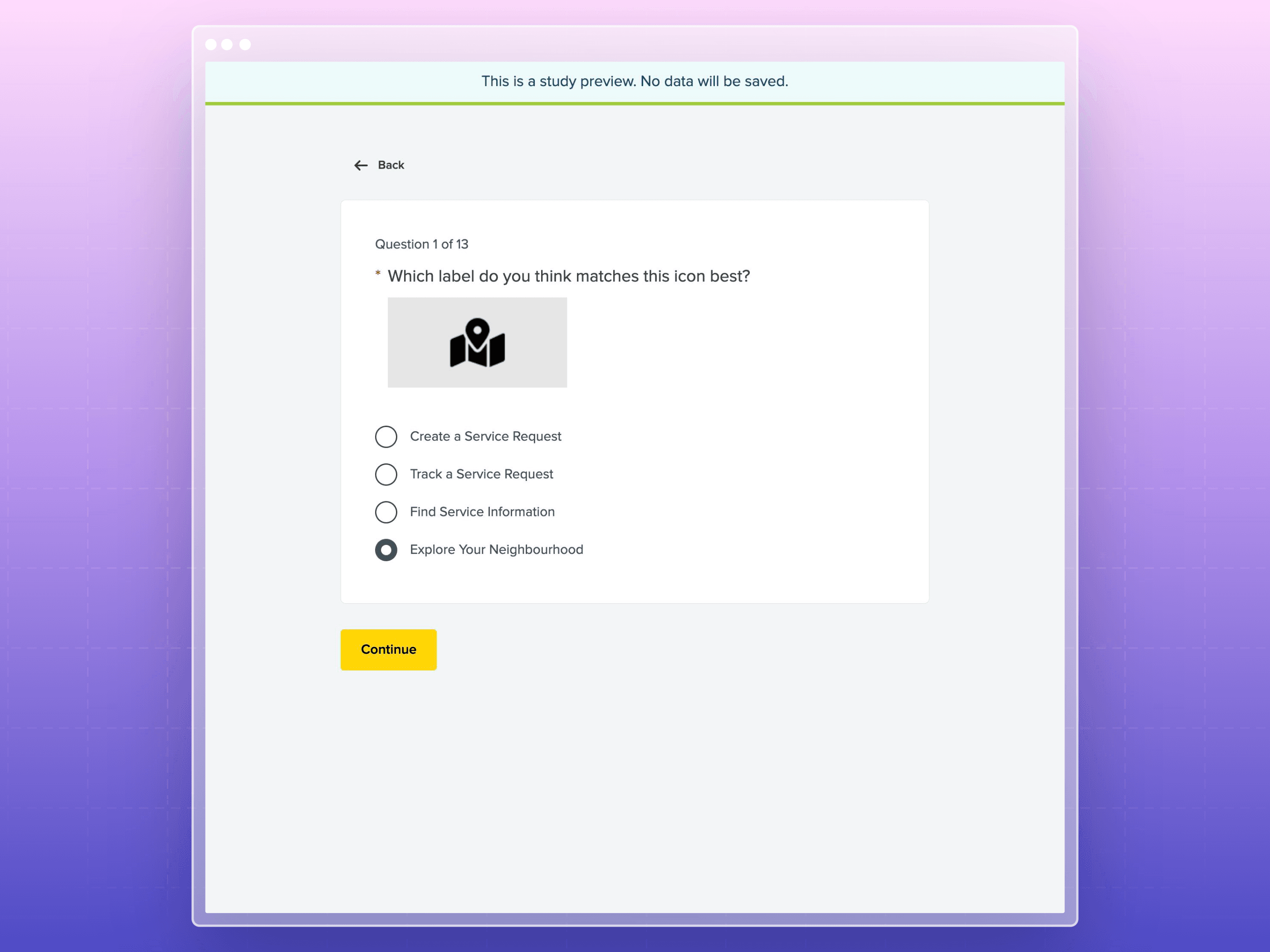
This activity was crafted to understand how users associate visual representations with specific services. Participants were presented with a series of icons and asked to select the label they believed best described each icon. This test covered various service categories, including service requests, tracking, finding information, and neighborhood exploration, among others. The diverse icon set aimed to gauge the intuitiveness and clarity of the icons used on the website, identifying any discrepancies between the intended and perceived meanings.
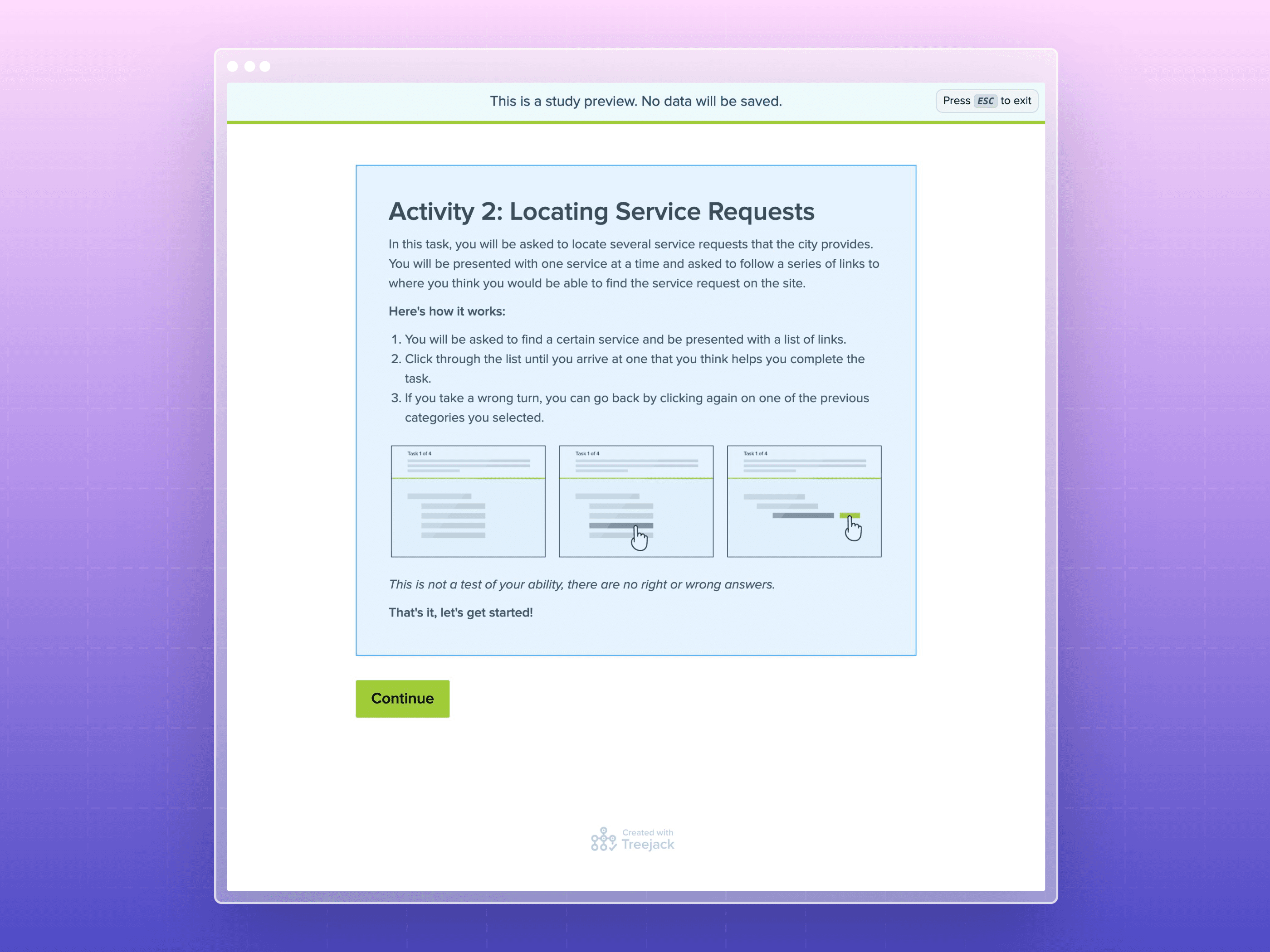
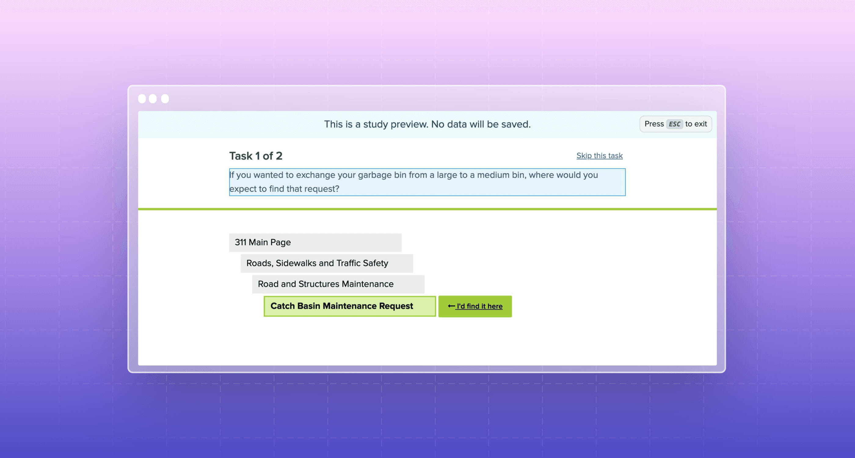
Activity 2: Locating Service Requests
The core of this activity was to assess the navigational structure and category intuitiveness of the service request process. Participants were tasked with locating specific services within the website's hierarchical structure, simulating real-world scenarios. This activity provided insights into the user's journey through the site, highlighting potential areas of confusion or misdirection and identifying how users expect to find information based on the given categories and sub-categories.
Activity 3: Closing Questions
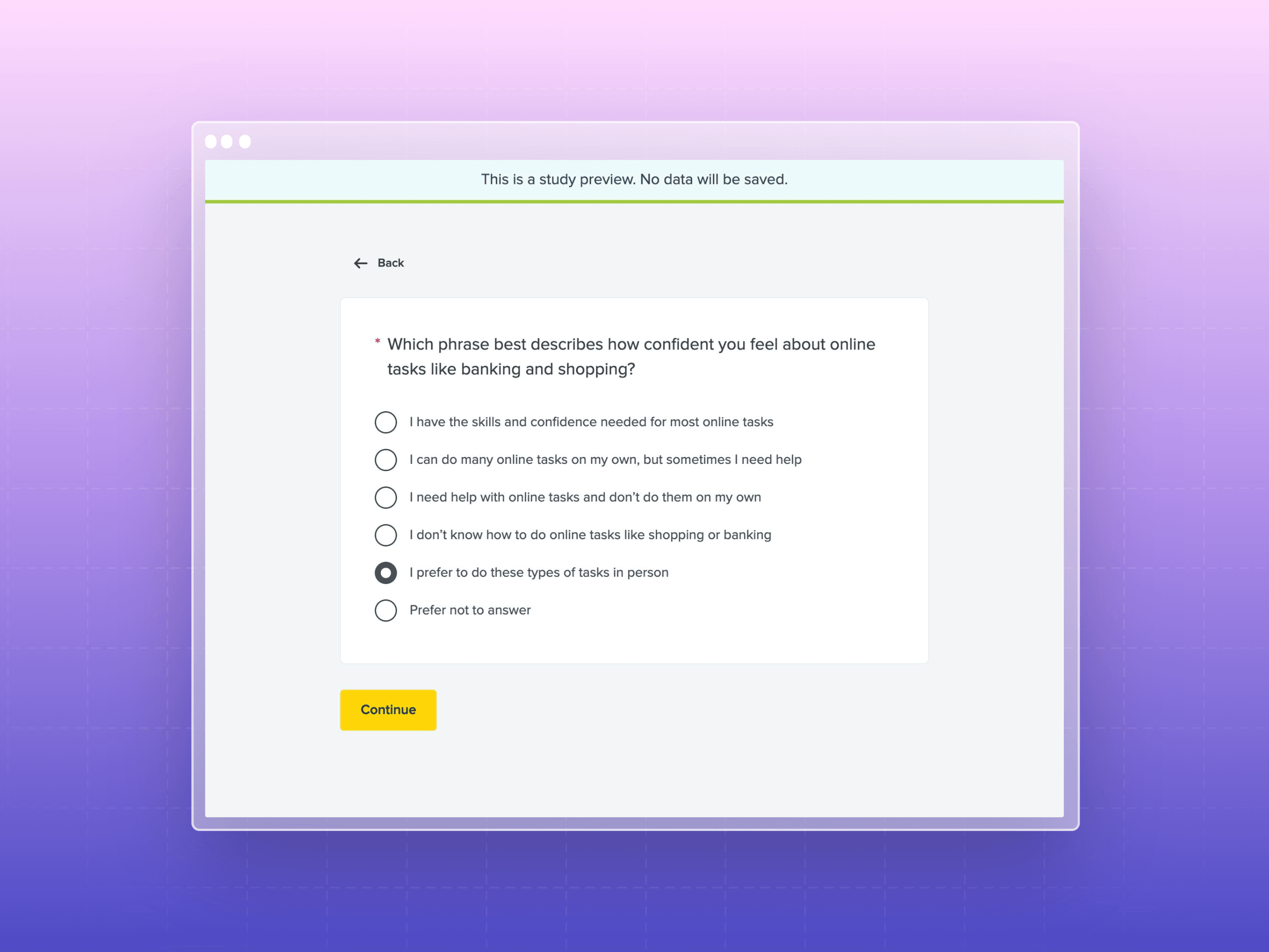
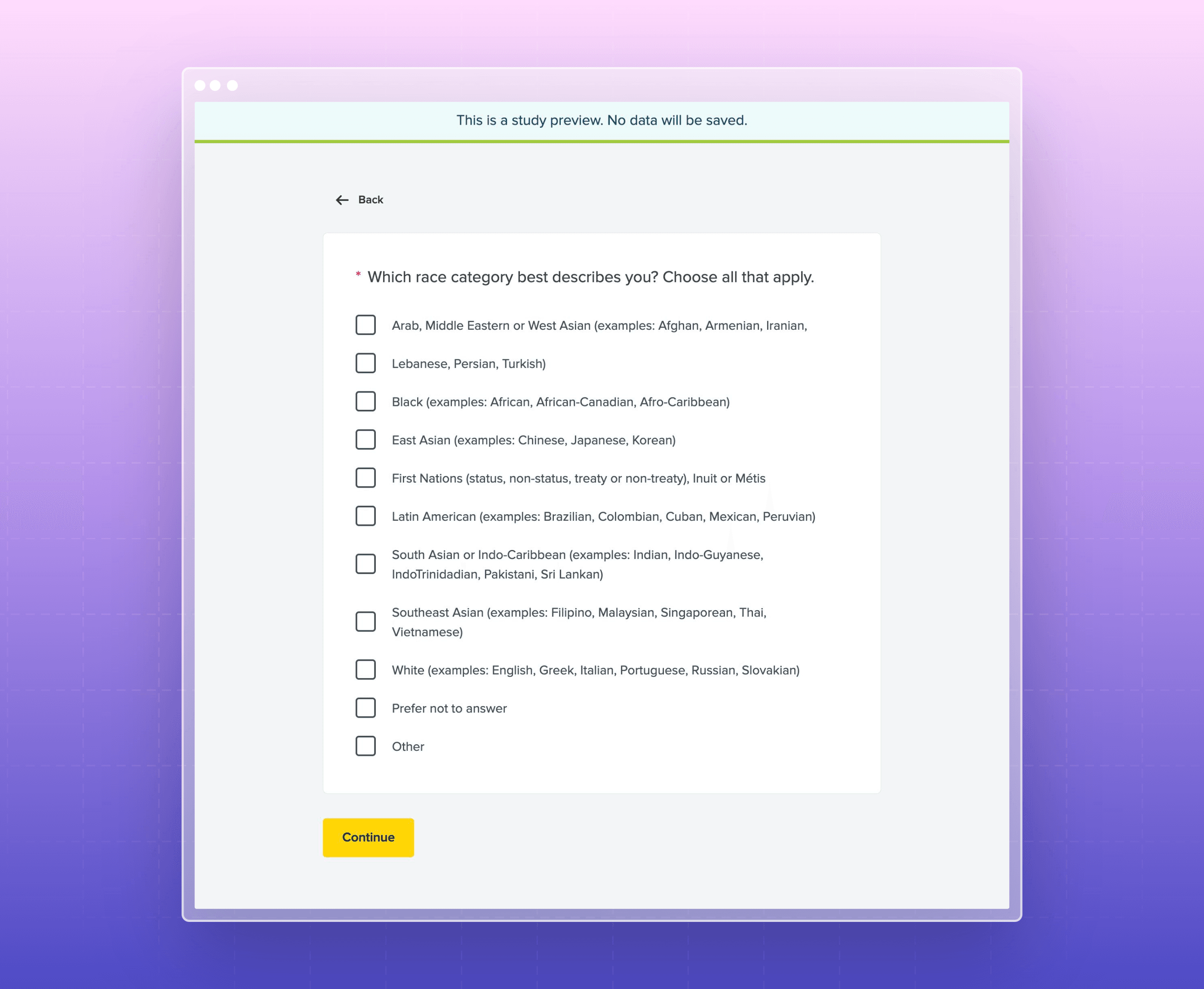
Concluding the session, participants were asked a series of demographic and experiential questions, aiming to capture a comprehensive profile of the user base. These questions covered employment status with the city, frequency of contact with city services, preferred devices for internet browsing, online task confidence, age, language preference, residency duration, and more. This activity was crucial for ensuring the research encompassed a wide range of perspectives and experiences, allowing for a more inclusive understanding of the website's usability across different demographics.
Findings and Insights
Participant Profile
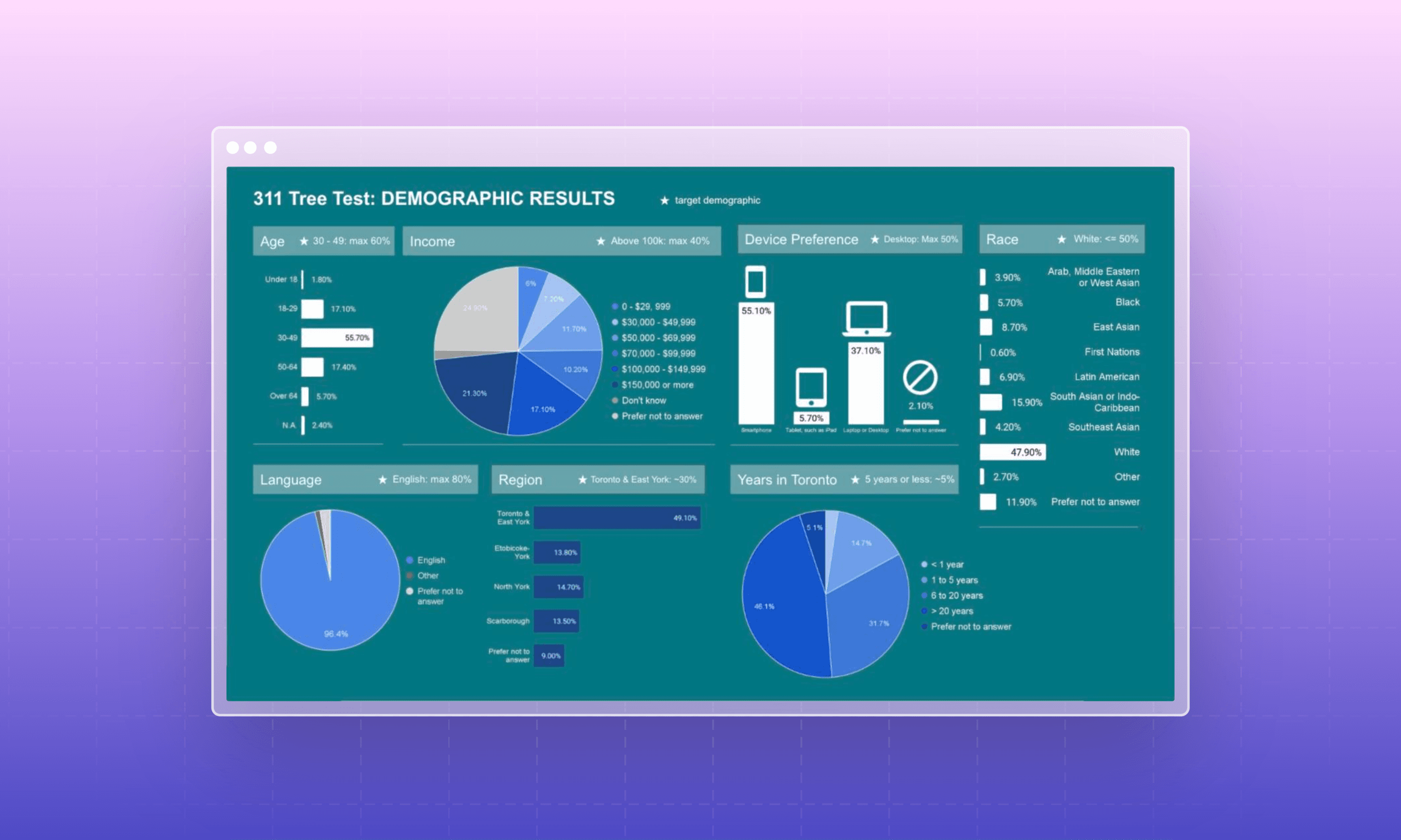
Findings: The research was completed by 341 participants, including 22 City of Toronto (CoT) 311 employees. A majority (54%) had never contacted the CoT regarding city services. The demographic breakdown revealed that 48% of participants identified as "White", with 40% identifying with other racial backgrounds, including 2 Indigenous respondents, and 12% preferred not to answer. About 16% of participants identified as having a disability, 17% had been in Toronto for less than 5 years, and the age distribution was fairly balanced with a slight skew towards the 30 to 49 age group (56%), 19% under 30, and 23% over 50.
Participant Quotes: "I often find myself lost in the website, unsure where to click next," shared one participant, highlighting the need for clearer navigation paths.
Insights: The participant profile highlights a fairly representative sample of Toronto residents, with a good mix of demographics, though with room for improvement in diversity. The underrepresentation of non-English speakers and participants from regions outside Toronto & East York suggests a need for targeted recruitment strategies to ensure a more diverse and representative sample in future research. Enhancing the diversity of participants could provide more nuanced insights into the usability and accessibility of the city’s website across different community groups.
Icon Recommendations
Findings: The study identified a need to replace three specific icons and redesign two others due to their ambiguity. Participants found these icons confusing, which hindered their ability to quickly understand the service they represented.
Insights: The ambiguity of these icons suggests a mismatch between the visual representation and users' expectations or interpretations. Clear and intuitive icons are crucial for a seamless navigation experience, especially in a service-oriented context where users seek quick and efficient solutions.
Locating Service Request Recommendations
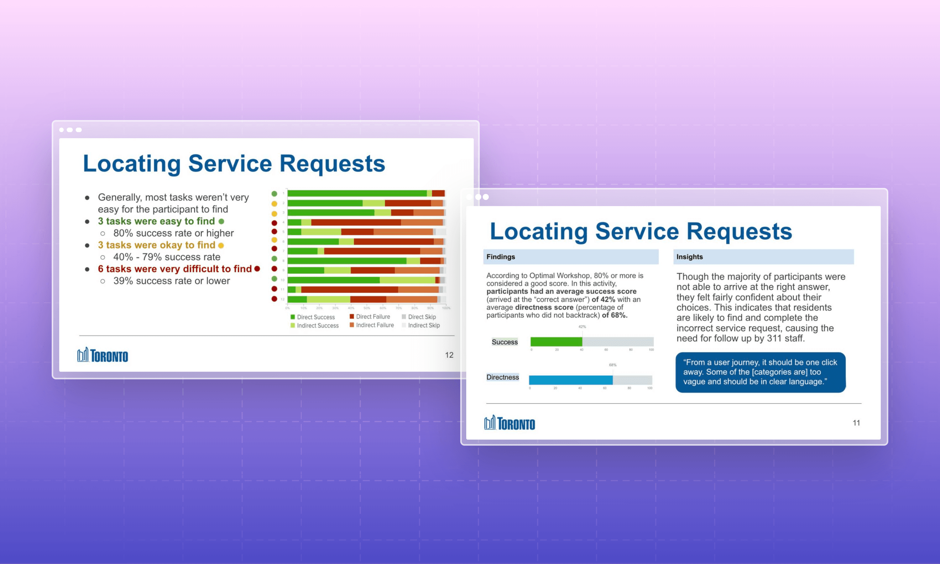
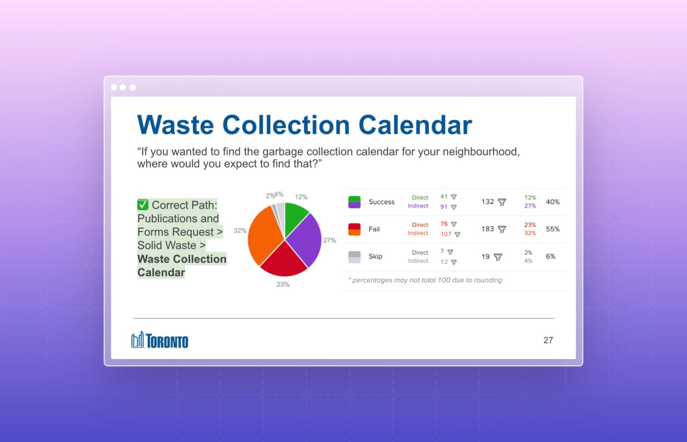
Findings: Recommendations were made to rename and reorganize certain categories to better align with user expectations. It was also suggested that some service requests should be accessible through multiple categories/sub-categories to accommodate diverse user mental models. The categorization of “Complaints and Compliments” and “Publications and Forms Request” was specifically highlighted for reconsideration, with a suggestion to separate the feedback process from service requests and to integrate forms more intuitively within relevant categories or a dedicated directory.
Insights: These findings indicate a potential for improving the website's navigational structure to enhance findability and user satisfaction. Streamlining the categorization and accessibility of information can significantly impact the overall user experience, making it more intuitive and user-friendly. Additionally, segmenting feedback from service requests could clarify the purpose of each category, potentially increasing the efficiency of processing and responding to user inputs.
Conclusions and Recommendations
The study provided valuable insights into the user experience of navigating the City of Toronto's service request portal. Key recommendations included refining ambiguous categories and sub-categories, redesigning ineffective icons, and restructuring the navigation path to enhance intuitiveness and efficiency. Implementing these changes is expected to improve the online service request submission process, making it a more appealing option for residents and businesses alike.
Key Takeaways
The Significance of Content Hierarchy and Information Architecture
This project underscored the crucial role of content hierarchy and information architecture in enhancing user navigation and satisfaction. By aligning the website's structure with users' mental models, we can significantly reduce confusion and improve the efficiency of service requests. The challenge highlighted how essential it is to organize information logically and intuitively, ensuring users can find what they need without frustration.
Insights on Information Architecture
Evaluating the City of Toronto's service request portal revealed the importance of user-centered design principles. The diversity in user backgrounds demands a design approach that accommodates various perspectives, emphasizing that effective information architecture must reflect the users' language and navigational preferences. This project taught me that understanding and implementing user feedback is fundamental to creating an inclusive and accessible digital interface.
The Need for Ongoing Research and Inclusivity
The project highlighted a critical gap in representation among non-English speakers and underrepresented groups, underscoring the importance of inclusive UX research. Continuous engagement with a broad spectrum of users is vital for uncovering diverse needs and preferences. This calls for expanded research methodologies and a commitment to iterative design, ensuring that digital services evolve to meet the changing demands of all city residents.
Full List of Test Questions
Click here to view the demo for the final survey. For a more in-depth breakdown of the findings, email me and ask me more!
Become a Digital Citizen Advisor
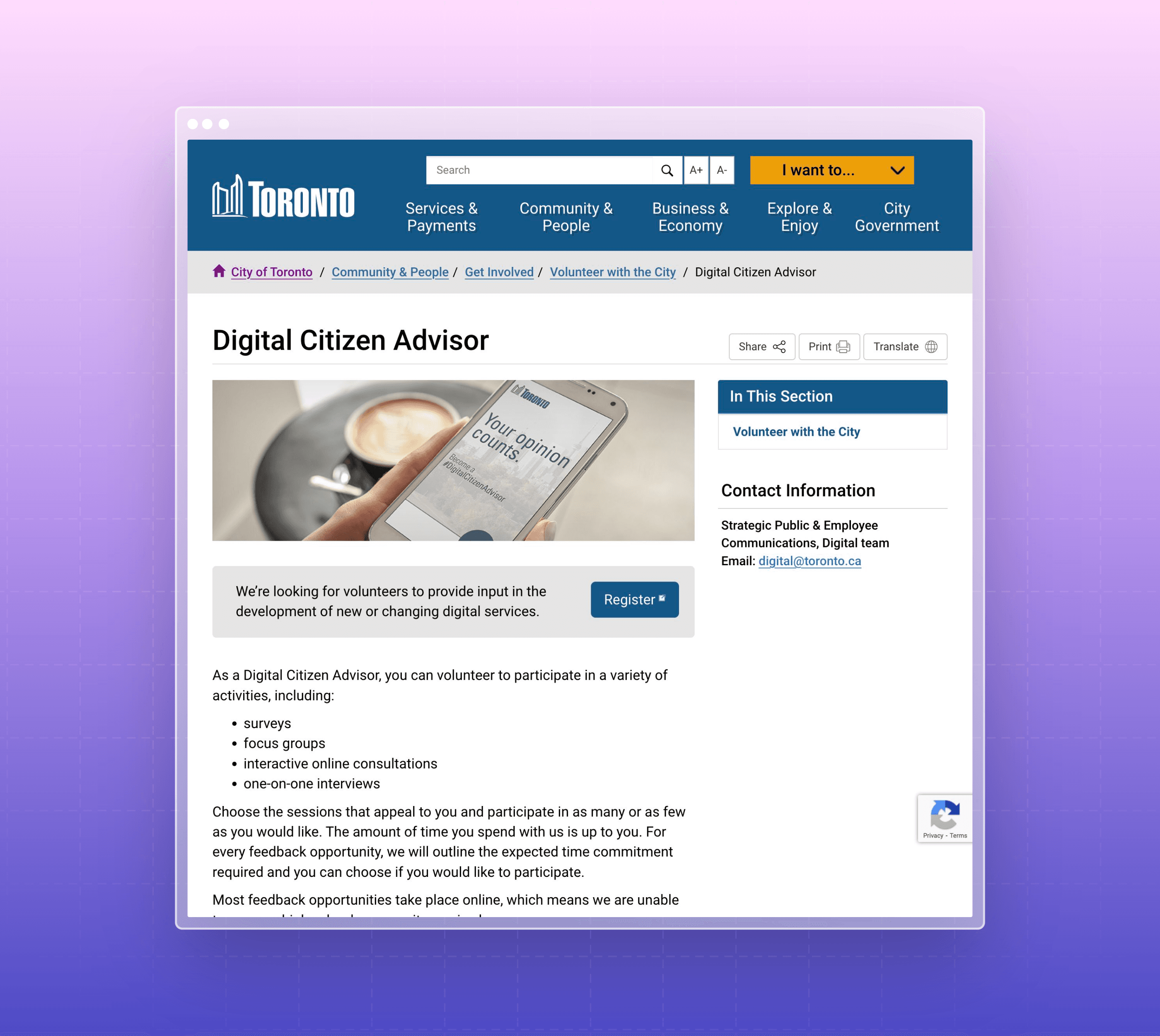
If you would like to volunteer to participate in surveys, interviews, and interviews for the city, sign up to become a digital citizen advisor. It's a great opportunity to help the city improve its digital services for everyone to enjoy! (And it makes researchers and designers like myself very happy as well 😉).


City of Toronto | Optimizing Service Request Navigation
RESEARCH
ANALYSIS
As a research intern at the City of Toronto, I was tasked with the challenge of enhancing the digital interface through which residents interact with city services. This case study outlines a UX research project conducted by a research intern at the City of Toronto, focusing on improving the digital interface for city service requests. The project's goal was to make online submissions more intuitive, thereby reducing reliance on phone-based inquiries.
Through a comprehensive study involving 341 participants, key areas for improvement were identified in iconography, category organization, and the overall navigational structure of the service request portal. Recommendations include redesigning ambiguous icons, reorganizing service categories for better intuitiveness, and making specific service requests more accessible. This study aims to enhance the user experience significantly, making the digital portal a preferable option for city residents.

Background
Prior observations and user feedback highlighted challenges within the City of Toronto’s digital interface for service requests. Users reported difficulties in navigating the system, identifying the correct categories for their needs, and understanding the icons used on the portal. These issues contributed to a reliance on phone-based inquiries, indicating a clear need for a more intuitive online submission process.
Objective
The primary goal was to evaluate and enhance the user experience on the City of Toronto website, specifically within the service request sections. We aimed to achieve specific improvements in user behavior, such as a 20% increase in online submissions and a 15% reduction in phone inquiries, by making the navigation process simple and intuitive for all residents.
Participant Profile
The research involved a diverse group of 50 to 200 Toronto residents, varying in their experiences with city services, demographic characteristics (age and location), and familiarity with the city's digital resources. This diverse mix was intended to provide a comprehensive understanding of different user experiences and perspectives.
Methodology
We conducted the study using remote, unmoderated sessions, employing OptimalSort and Treejack from Optimal Workshop's UX suite. The process began with participants answering initial questions, followed by tasks that involved sorting, finding, and matching various service request features into predefined categories and subcategories. This also included assessing the effectiveness of labels, icons, and their distinctiveness. Post-test feedback was collected to identify potential improvements.
Activity 1: Icon Evaluation
This activity was crafted to understand how users associate visual representations with specific services. Participants were presented with a series of icons and asked to select the label they believed best described each icon. This test covered various service categories, including service requests, tracking, finding information, and neighborhood exploration, among others. The diverse icon set aimed to gauge the intuitiveness and clarity of the icons used on the website, identifying any discrepancies between the intended and perceived meanings.

Activity 2: Locating Service Requests
The core of this activity was to assess the navigational structure and category intuitiveness of the service request process. Participants were tasked with locating specific services within the website's hierarchical structure, simulating real-world scenarios. This activity provided insights into the user's journey through the site, highlighting potential areas of confusion or misdirection and identifying how users expect to find information based on the given categories and sub-categories.


Activity 3: Closing Questions
Concluding the session, participants were asked a series of demographic and experiential questions, aiming to capture a comprehensive profile of the user base. These questions covered employment status with the city, frequency of contact with city services, preferred devices for internet browsing, online task confidence, age, language preference, residency duration, and more. This activity was crucial for ensuring the research encompassed a wide range of perspectives and experiences, allowing for a more inclusive understanding of the website's usability across different demographics.


Findings and Insights
Participant Profile
Findings: The research was completed by 341 participants, including 22 City of Toronto (CoT) 311 employees. A majority (54%) had never contacted the CoT regarding city services. The demographic breakdown revealed that 48% of participants identified as "White", with 40% identifying with other racial backgrounds, including 2 Indigenous respondents, and 12% preferred not to answer. About 16% of participants identified as having a disability, 17% had been in Toronto for less than 5 years, and the age distribution was fairly balanced with a slight skew towards the 30 to 49 age group (56%), 19% under 30, and 23% over 50.
Participant Quotes: "I often find myself lost in the website, unsure where to click next," shared one participant, highlighting the need for clearer navigation paths.
Insights: The participant profile highlights a fairly representative sample of Toronto residents, with a good mix of demographics, though with room for improvement in diversity. The underrepresentation of non-English speakers and participants from regions outside Toronto & East York suggests a need for targeted recruitment strategies to ensure a more diverse and representative sample in future research. Enhancing the diversity of participants could provide more nuanced insights into the usability and accessibility of the city’s website across different community groups.

Icon Recommendations
Findings: The study identified a need to replace three specific icons and redesign two others due to their ambiguity. Participants found these icons confusing, which hindered their ability to quickly understand the service they represented.
Insights: The ambiguity of these icons suggests a mismatch between the visual representation and users' expectations or interpretations. Clear and intuitive icons are crucial for a seamless navigation experience, especially in a service-oriented context where users seek quick and efficient solutions.
Locating Service Request Recommendations
Findings: Recommendations were made to rename and reorganize certain categories to better align with user expectations. It was also suggested that some service requests should be accessible through multiple categories/sub-categories to accommodate diverse user mental models. The categorization of “Complaints and Compliments” and “Publications and Forms Request” was specifically highlighted for reconsideration, with a suggestion to separate the feedback process from service requests and to integrate forms more intuitively within relevant categories or a dedicated directory.
Insights: These findings indicate a potential for improving the website's navigational structure to enhance findability and user satisfaction. Streamlining the categorization and accessibility of information can significantly impact the overall user experience, making it more intuitive and user-friendly. Additionally, segmenting feedback from service requests could clarify the purpose of each category, potentially increasing the efficiency of processing and responding to user inputs.


Conclusions and Recommendations
The study provided valuable insights into the user experience of navigating the City of Toronto's service request portal. Key recommendations included refining ambiguous categories and sub-categories, redesigning ineffective icons, and restructuring the navigation path to enhance intuitiveness and efficiency. Implementing these changes is expected to improve the online service request submission process, making it a more appealing option for residents and businesses alike.
Key Takeaways
The Significance of Content Hierarchy and Information Architecture
This project underscored the crucial role of content hierarchy and information architecture in enhancing user navigation and satisfaction. By aligning the website's structure with users' mental models, we can significantly reduce confusion and improve the efficiency of service requests. The challenge highlighted how essential it is to organize information logically and intuitively, ensuring users can find what they need without frustration.
Insights on Information Architecture
Evaluating the City of Toronto's service request portal revealed the importance of user-centered design principles. The diversity in user backgrounds demands a design approach that accommodates various perspectives, emphasizing that effective information architecture must reflect the users' language and navigational preferences. This project taught me that understanding and implementing user feedback is fundamental to creating an inclusive and accessible digital interface.
The Need for Ongoing Research and Inclusivity
The project highlighted a critical gap in representation among non-English speakers and underrepresented groups, underscoring the importance of inclusive UX research. Continuous engagement with a broad spectrum of users is vital for uncovering diverse needs and preferences. This calls for expanded research methodologies and a commitment to iterative design, ensuring that digital services evolve to meet the changing demands of all city residents.
Full List of Test Questions
Click here to view the demo for the final survey. For a more in-depth breakdown of the findings, email me and ask me more!
Become a Digital Citizen Advisor
If you would like to volunteer to participate in surveys, interviews, and interviews for the city, sign up to become a digital citizen advisor. It's a great opportunity to help the city improve its digital services for everyone to enjoy! (And it makes researchers and designers like myself very happy as well 😉).


City of Toronto | Optimizing Service Request Navigation
RESEARCH
ANALYSIS
As a research intern at the City of Toronto, I was tasked with the challenge of enhancing the digital interface through which residents interact with city services. This case study outlines a UX research project conducted by a research intern at the City of Toronto, focusing on improving the digital interface for city service requests. The project's goal was to make online submissions more intuitive, thereby reducing reliance on phone-based inquiries.
Through a comprehensive study involving 341 participants, key areas for improvement were identified in iconography, category organization, and the overall navigational structure of the service request portal. Recommendations include redesigning ambiguous icons, reorganizing service categories for better intuitiveness, and making specific service requests more accessible. This study aims to enhance the user experience significantly, making the digital portal a preferable option for city residents.

Background
Prior observations and user feedback highlighted challenges within the City of Toronto’s digital interface for service requests. Users reported difficulties in navigating the system, identifying the correct categories for their needs, and understanding the icons used on the portal. These issues contributed to a reliance on phone-based inquiries, indicating a clear need for a more intuitive online submission process.
Objective
The primary goal was to evaluate and enhance the user experience on the City of Toronto website, specifically within the service request sections. We aimed to achieve specific improvements in user behavior, such as a 20% increase in online submissions and a 15% reduction in phone inquiries, by making the navigation process simple and intuitive for all residents.
Participant Profile
The research involved a diverse group of 50 to 200 Toronto residents, varying in their experiences with city services, demographic characteristics (age and location), and familiarity with the city's digital resources. This diverse mix was intended to provide a comprehensive understanding of different user experiences and perspectives.
Methodology
We conducted the study using remote, unmoderated sessions, employing OptimalSort and Treejack from Optimal Workshop's UX suite. The process began with participants answering initial questions, followed by tasks that involved sorting, finding, and matching various service request features into predefined categories and subcategories. This also included assessing the effectiveness of labels, icons, and their distinctiveness. Post-test feedback was collected to identify potential improvements.
Activity 1: Icon Evaluation
This activity was crafted to understand how users associate visual representations with specific services. Participants were presented with a series of icons and asked to select the label they believed best described each icon. This test covered various service categories, including service requests, tracking, finding information, and neighborhood exploration, among others. The diverse icon set aimed to gauge the intuitiveness and clarity of the icons used on the website, identifying any discrepancies between the intended and perceived meanings.

Activity 2: Locating Service Requests
The core of this activity was to assess the navigational structure and category intuitiveness of the service request process. Participants were tasked with locating specific services within the website's hierarchical structure, simulating real-world scenarios. This activity provided insights into the user's journey through the site, highlighting potential areas of confusion or misdirection and identifying how users expect to find information based on the given categories and sub-categories.


Activity 3: Closing Questions
Concluding the session, participants were asked a series of demographic and experiential questions, aiming to capture a comprehensive profile of the user base. These questions covered employment status with the city, frequency of contact with city services, preferred devices for internet browsing, online task confidence, age, language preference, residency duration, and more. This activity was crucial for ensuring the research encompassed a wide range of perspectives and experiences, allowing for a more inclusive understanding of the website's usability across different demographics.


Findings and Insights
Participant Profile
Findings: The research was completed by 341 participants, including 22 City of Toronto (CoT) 311 employees. A majority (54%) had never contacted the CoT regarding city services. The demographic breakdown revealed that 48% of participants identified as "White", with 40% identifying with other racial backgrounds, including 2 Indigenous respondents, and 12% preferred not to answer. About 16% of participants identified as having a disability, 17% had been in Toronto for less than 5 years, and the age distribution was fairly balanced with a slight skew towards the 30 to 49 age group (56%), 19% under 30, and 23% over 50.
Participant Quotes: "I often find myself lost in the website, unsure where to click next," shared one participant, highlighting the need for clearer navigation paths.
Insights: The participant profile highlights a fairly representative sample of Toronto residents, with a good mix of demographics, though with room for improvement in diversity. The underrepresentation of non-English speakers and participants from regions outside Toronto & East York suggests a need for targeted recruitment strategies to ensure a more diverse and representative sample in future research. Enhancing the diversity of participants could provide more nuanced insights into the usability and accessibility of the city’s website across different community groups.

Icon Recommendations
Findings: The study identified a need to replace three specific icons and redesign two others due to their ambiguity. Participants found these icons confusing, which hindered their ability to quickly understand the service they represented.
Insights: The ambiguity of these icons suggests a mismatch between the visual representation and users' expectations or interpretations. Clear and intuitive icons are crucial for a seamless navigation experience, especially in a service-oriented context where users seek quick and efficient solutions.
Locating Service Request Recommendations
Findings: Recommendations were made to rename and reorganize certain categories to better align with user expectations. It was also suggested that some service requests should be accessible through multiple categories/sub-categories to accommodate diverse user mental models. The categorization of “Complaints and Compliments” and “Publications and Forms Request” was specifically highlighted for reconsideration, with a suggestion to separate the feedback process from service requests and to integrate forms more intuitively within relevant categories or a dedicated directory.
Insights: These findings indicate a potential for improving the website's navigational structure to enhance findability and user satisfaction. Streamlining the categorization and accessibility of information can significantly impact the overall user experience, making it more intuitive and user-friendly. Additionally, segmenting feedback from service requests could clarify the purpose of each category, potentially increasing the efficiency of processing and responding to user inputs.


Conclusions and Recommendations
The study provided valuable insights into the user experience of navigating the City of Toronto's service request portal. Key recommendations included refining ambiguous categories and sub-categories, redesigning ineffective icons, and restructuring the navigation path to enhance intuitiveness and efficiency. Implementing these changes is expected to improve the online service request submission process, making it a more appealing option for residents and businesses alike.
Key Takeaways
The Significance of Content Hierarchy and Information Architecture
This project underscored the crucial role of content hierarchy and information architecture in enhancing user navigation and satisfaction. By aligning the website's structure with users' mental models, we can significantly reduce confusion and improve the efficiency of service requests. The challenge highlighted how essential it is to organize information logically and intuitively, ensuring users can find what they need without frustration.
Insights on Information Architecture
Evaluating the City of Toronto's service request portal revealed the importance of user-centered design principles. The diversity in user backgrounds demands a design approach that accommodates various perspectives, emphasizing that effective information architecture must reflect the users' language and navigational preferences. This project taught me that understanding and implementing user feedback is fundamental to creating an inclusive and accessible digital interface.
The Need for Ongoing Research and Inclusivity
The project highlighted a critical gap in representation among non-English speakers and underrepresented groups, underscoring the importance of inclusive UX research. Continuous engagement with a broad spectrum of users is vital for uncovering diverse needs and preferences. This calls for expanded research methodologies and a commitment to iterative design, ensuring that digital services evolve to meet the changing demands of all city residents.
Full List of Test Questions
Click here to view the demo for the final survey. For a more in-depth breakdown of the findings, email me and ask me more!
Become a Digital Citizen Advisor
If you would like to volunteer to participate in surveys, interviews, and interviews for the city, sign up to become a digital citizen advisor. It's a great opportunity to help the city improve its digital services for everyone to enjoy! (And it makes researchers and designers like myself very happy as well 😉).
